#include CMS
How I targeted my organization's product CRM system so that clients can modify their products through more a efficient CMS that meets user needs.
Timeline
April 2024
(1 month)
Role
Product Designer
(Just me)
Tools Used
Figma
Figjam
Responsibilities
User Research
Design Direction
Business considerations
CONTEXT
Providing a solution for clients' frustrations
#Include, a web design-development student organization at UC Davis boasts of client satisfaction with over 12+ clients in the span of 4 years. However, as years go by, many clients request to change the content of their website. The current method is through Strapi content management system (CMS) which various clients have noted does not match their needs as a website owner.
As a product designer, I designed an entirely new CMS with features focused on client business needs, and that simplifies the user flow. In addition, this product would ideally target our organization's goal of expanding our clientele and maintaining better relations with our current clients.
Business Objectives
User Experience
My Main Solutions
1
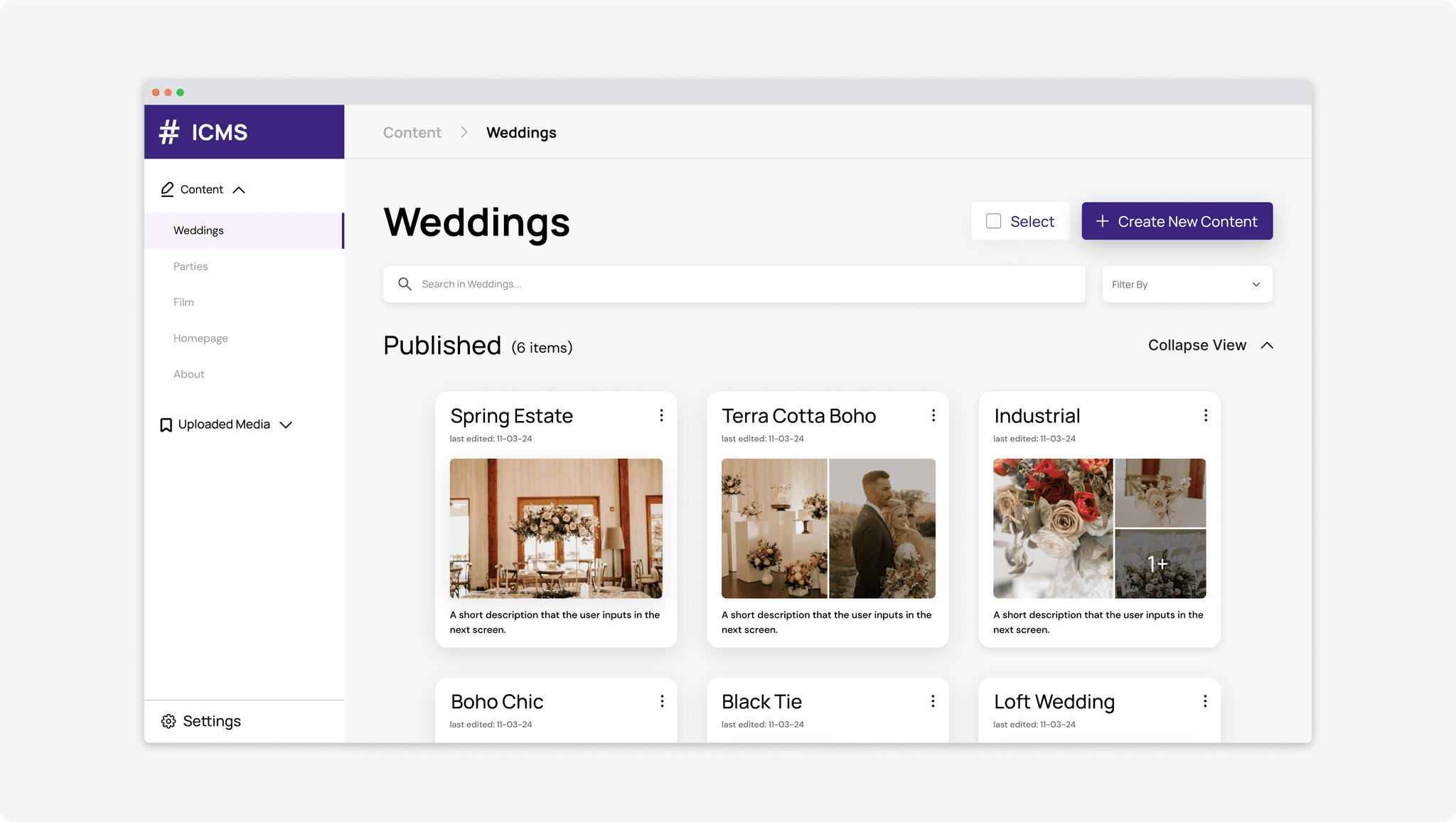
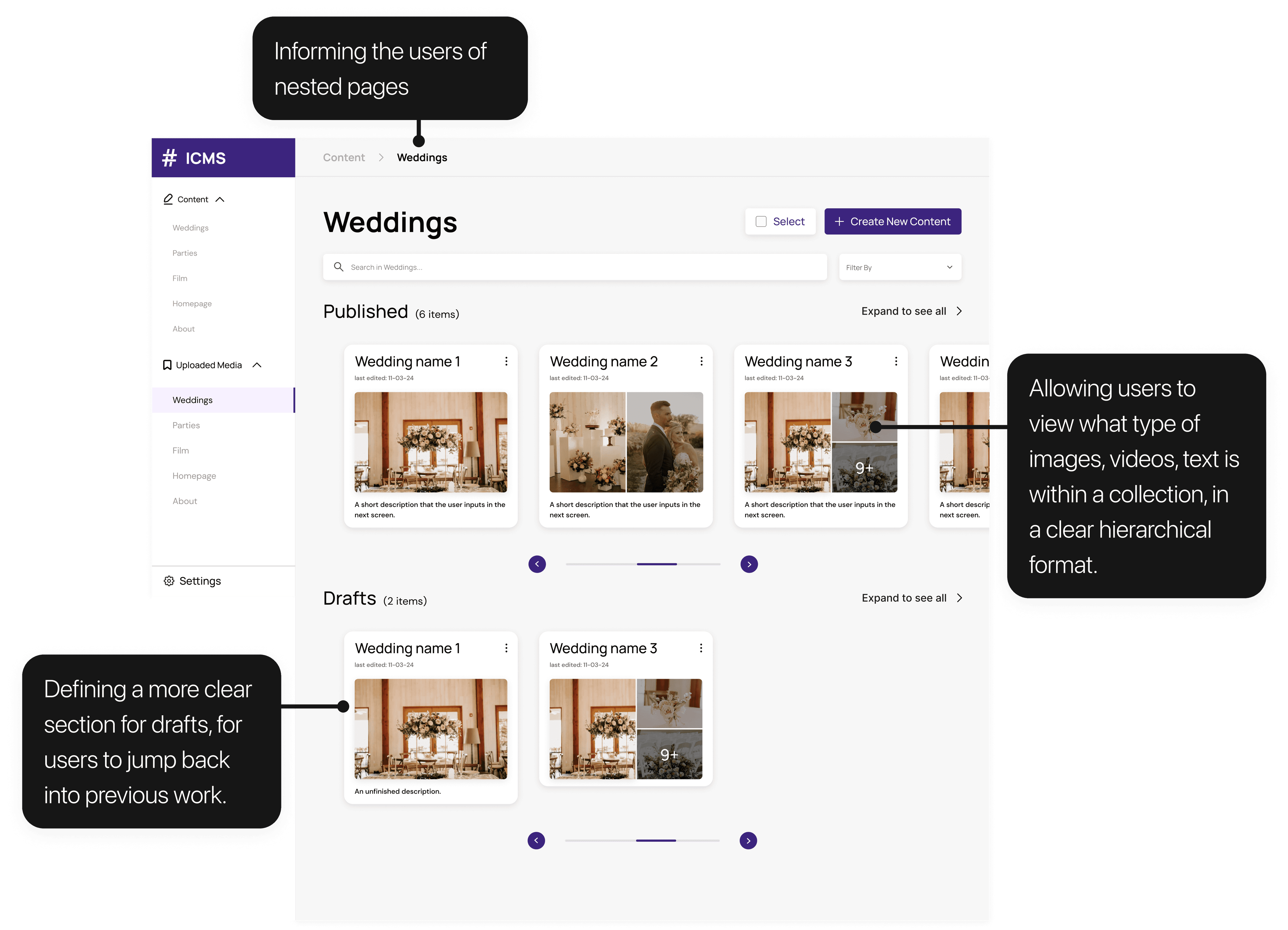
Each collection now has a more thorough layout for users
2
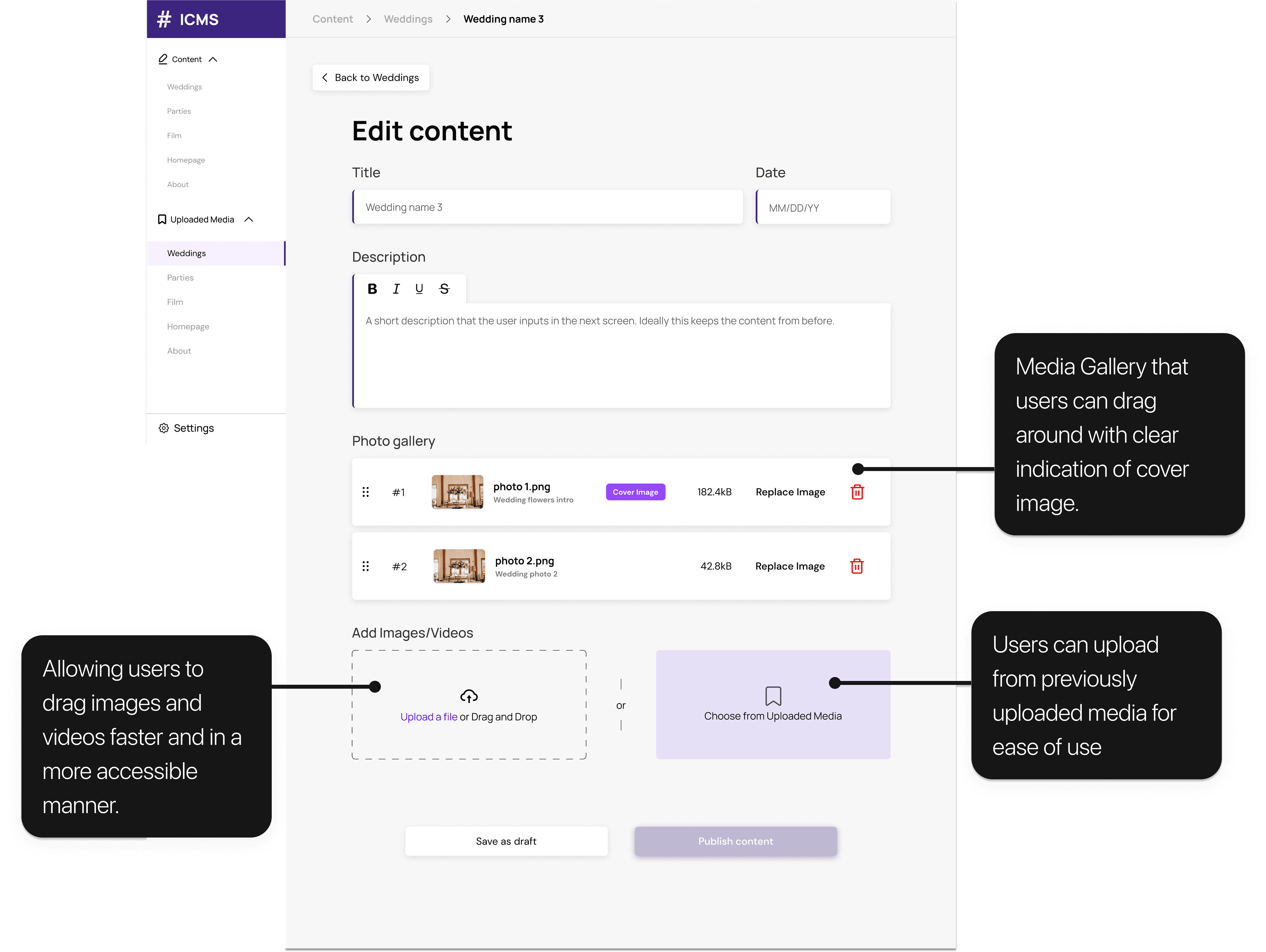
Easy-to-understand editing page
3
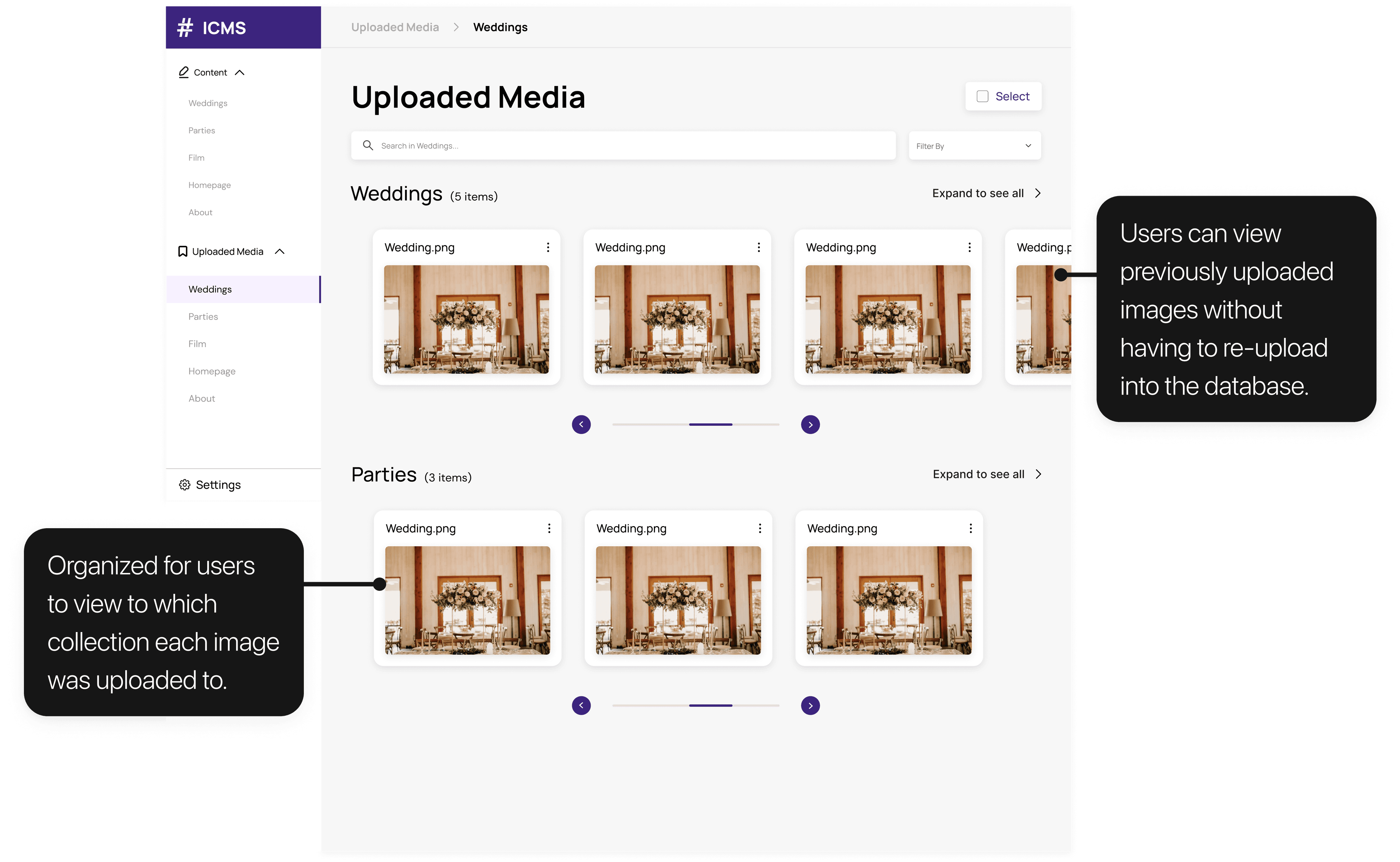
A new library page for past media
PROBLEM STATEMENT
How might we create an intuitive content management system that allows users to easily update website assets for an optimized search engine(SEO)?
MY INITIAL THOUGHTS/RESPONSES
What is the main focus for website owners?
I began by researching website owners' main focuses, especially in the context of owning a business or having a brand be seen (the main types of clients for #include). Here were some core statistics:
SEO
Text content/Alt text promotes websites on the internet, and the new design must be optimized for this.
94%
increase in traffic when visual content is inserted in a website. I should prioritizing editing media for users.
MORE LITERATURE REVIEW
More specifically, what about Strapi?
Strapi CMS is the current system our clients are using for #include. I researched various anecdotes as to what makes Strapi specifically difficult to deal with.
1
Strapi for Content Management, not Customer Relationships
"Though many Strapi features may be ideal for CRM's, they are often too complex for our target audience and confuses our clients."
2
Lack of Previews
"All components are marked with icons (no previews). With our number of different components, this becomes problematic on the content manager side."
INTERVIEW
What our users said about the current system
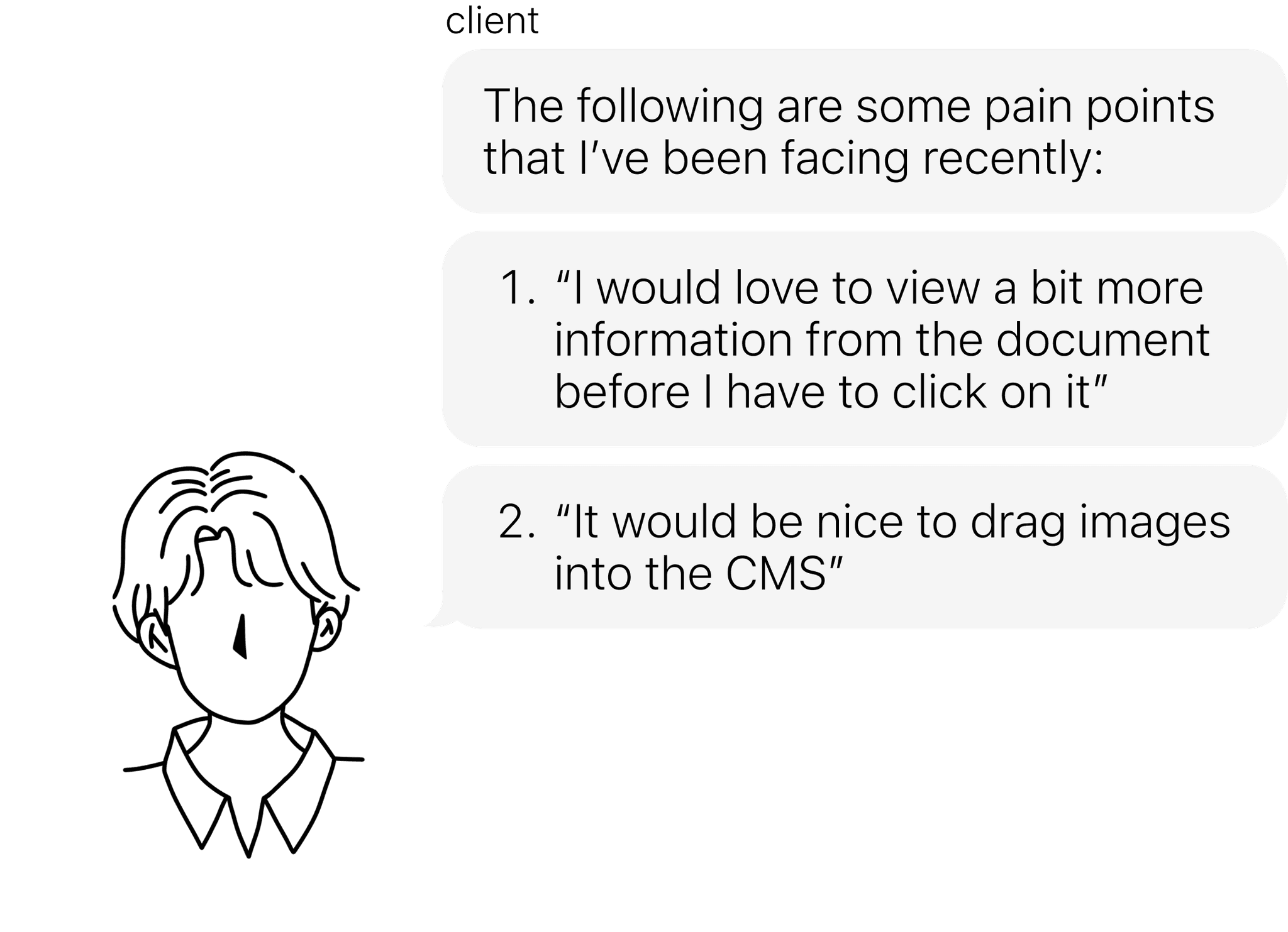
Though literature review was beneficial for some context, I needed the perspectives on the features our clients specifically are looking for, through Strapi CMS. In total, I interviewed 3 of our previous clients for their pain points and struggles with the current CMS.
"I'm having difficulty with…"
REVIEWING CURRENT DESIGN HEURISTICS
A deep-dive into Strapi CMS itself
Taking into consideration the user pain points, I went through Strapi to scan all the areas of improvement for accessibility, and ease of usage for clients.
This is the initial landing page for a website owner's CMS.
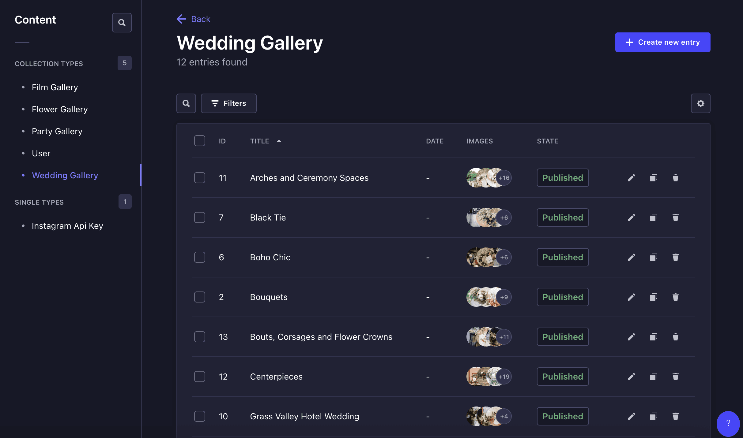
List format is hard to digest due to lack of emphasis on content and overwhelming points
It’s difficult to view exactly which image is in each collection due to size.
This is the landing page upon entering a collection.
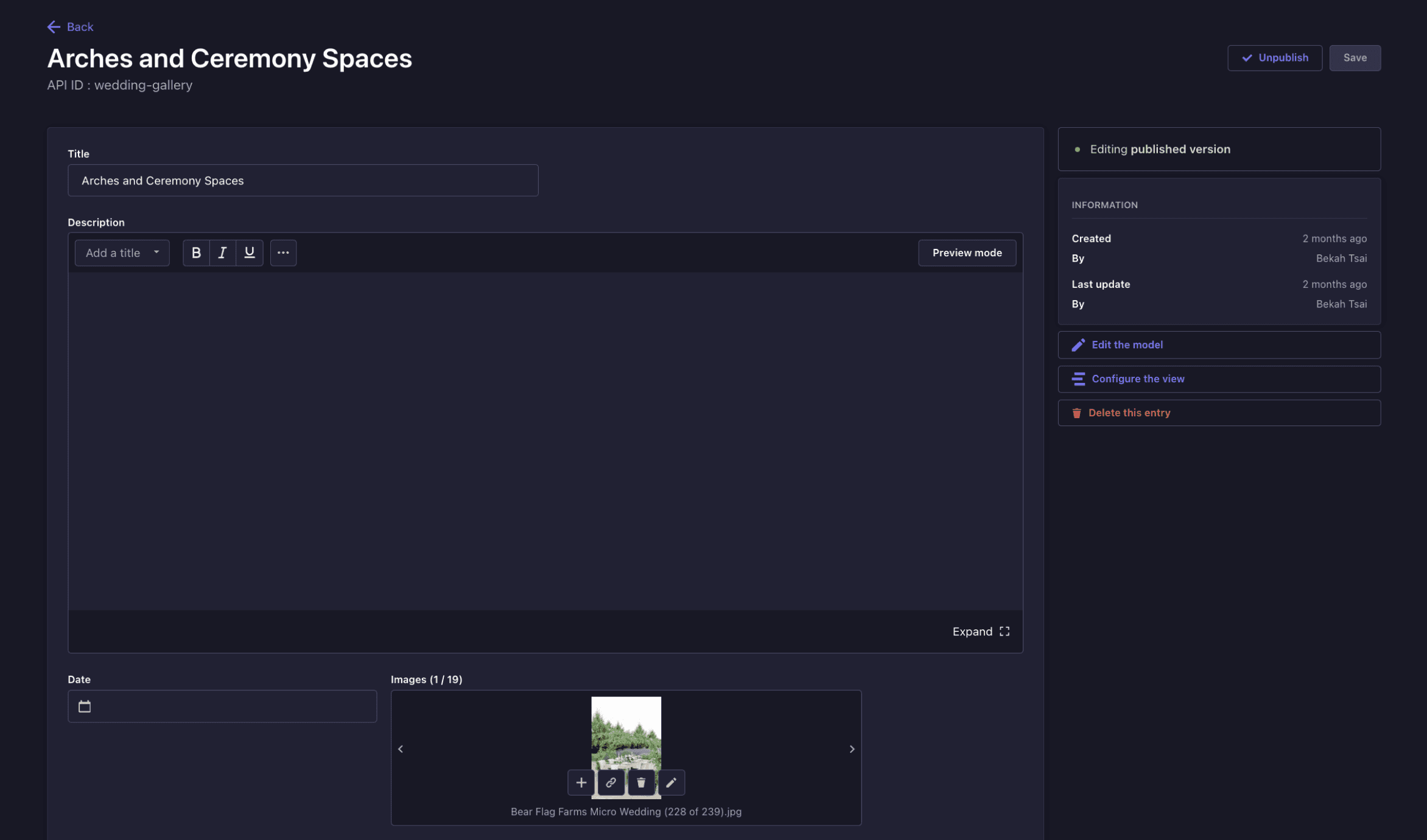
Brought immediately to edit mode; Confusing for users who may want to view only the CMS
Media is over looked by the text due to differences in size.
OUR RESEARCH GUIDE
3 pillars of research from consolidating data
With an affinity map, we were able to categorize and ideate with 3 main pain points. Each new design can be categorized under these three.
Guiding the user more
Users would like more visual cues such as previews and images that will tell the user what is behind a CTA.
Too many complex features
Users would like a less complex CMS that is catered to their needs (currently too many distractions).
Confusing flow
There are too many blockers from actions such as editing a collection; users would like a simpler way to maneuver through the site.
Information Architecture
IA over a user flow for holistic view
Because user flows follows a more linear user progression throughout the product, I mapped ideas from my research as an IA, as users are more able to freely move from task to another.
Content
Published Collections
Drafts Collections
Sub-collection 1
Sub-collection 2
Sub-collection X
Upload New Media
Select Media
Editing Media
Upload Media
Upload Description
Delete Media
Previously Uploaded
Media
Media
Sub-collection 1
Sub-collection 2
Sub-collection X
Upload New Media
Select Media
Editing Media
Upload Media
Delete Media
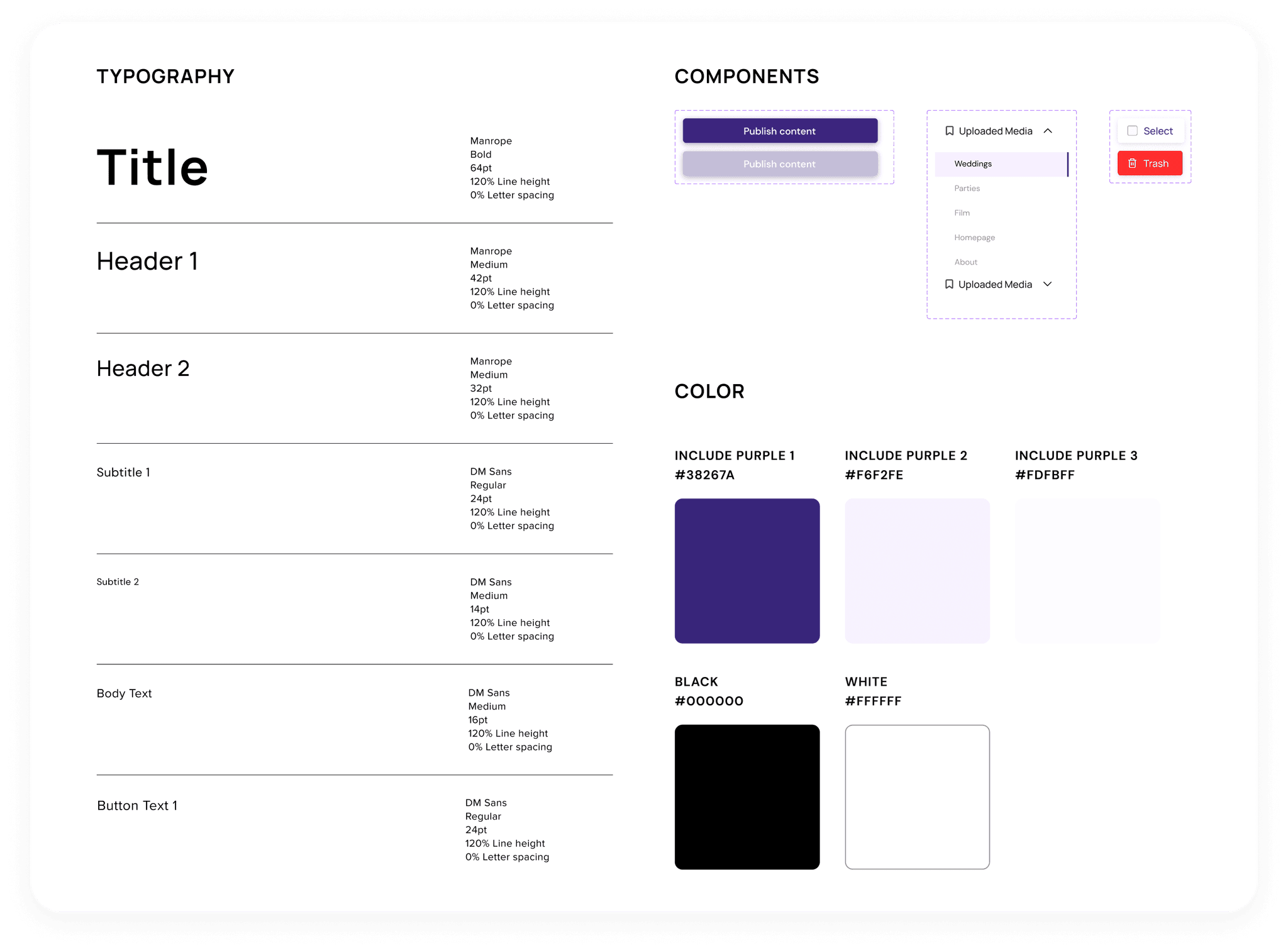
Style Guide
The style-scope for the CMS is the #Include's branding, such as the color purple—the color of wisdom, and ambition.
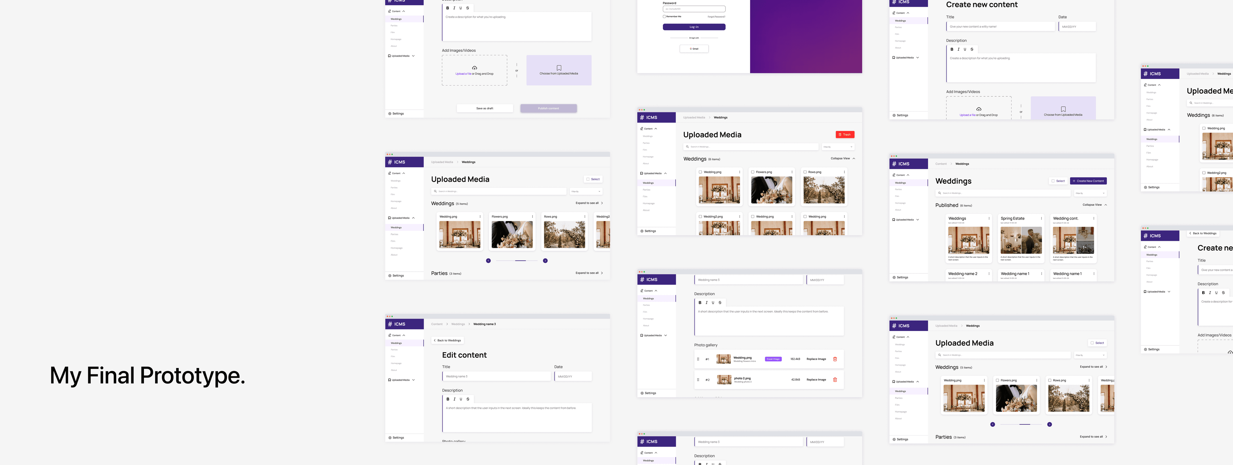
FINAL THOUGHTS
Here's what I learned & some next steps
Business-centric way of research and design direction
With our organization's goal of providing the best possible experience for our clients, I set out to design with user-centric thinking and their goal of increasing revenue. Within my research and designs, I juggled between accessibility and business objectives, which was a really interesting experience for me.
My plans for the future
This project is in progress to being developed. However, I would like to conduct further research how this project could be improved with our KPI's.
Thanks for making it this far!
You can either return to home page or check out how I designed a more effective way to judge California's largest collegiate-level hackathon!
made with ❤️, iced americanos, & heart-throb karaoke sessions
© Sechan Kim 2024